 emoji CIS
Brand architecture
One hub, three sub-brands
emoji — Taiwan Talent Hub is the master brand. at cafe, 3AM and Stay Square are the sub-brands that run inside the hub. Each has its own logo and brand color, and all share the master brand’s paper, ink and white space.
Shared rules
When the three sub-brands appear together, write them as in this table and keep this order.
| Sub-brand | In running text | Logo lettering | Brand color | Concept |
|---|---|---|---|---|
| at cafe | at cafe (在咖啡) | at café | #984C37 | Japanese set meals and working coffee |
| 3AM | 3AM (三點水) | 3am… Bistro | #6B8FAB | Late-night diner & bistro |
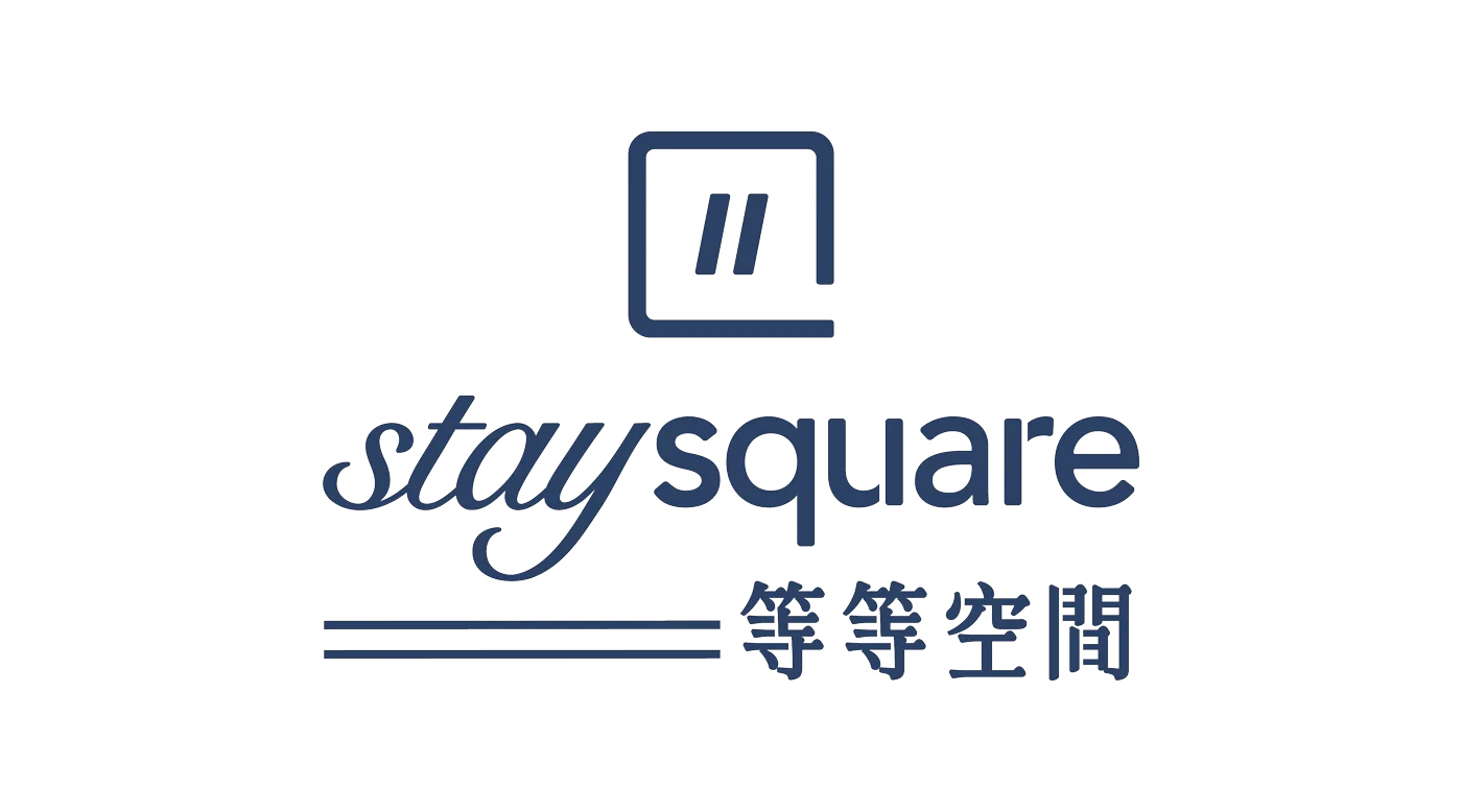
| Stay Square | Stay Square (等等空間) | stay square | #2B4064 | Members’ space for rest and work |
Fixed order
at cafe, 3AM, Stay Square. Side by side, the three logos share one height and equal spacing — none is bigger.
Master brand first
With the emoji logo, emoji goes on top or on the left; the sub-brand goes below or on the right.
Yellow is the master brand’s
#FFDE34 appears only in emoji layouts. Each sub-brand uses its own brand color.
Brands, not locations
Describe each place by its brand and function, never by its position in the building.