Corporate Identity System · 2026
Yohaku
is the identity.
The brand system for emoji — Taiwan Talent Hub. Not a decoration manual. Rules so logo, color, and type say the same thing on every surface.
Yohaku · The Philosophy
Yohaku is the undrawn space in a composition. It is not unfinished, nor leftover. It holds the same weight as the mark it frames.
True yohaku doesn’t read as “empty.” It reads as a brand that knows exactly what it wants to say — and so needn’t say much.
Naming · Brand Naming
One fixed spelling, inside and out. The Chinese and Japanese names use the full-width separator 「|」, never a dash; the English name uses an em dash.
The whole hub uses this Chinese name; sub-brands never replace the parent brand. Separator: full-width 「|」.
The whole hub uses this English name: always lowercase emoji and an em dash. The legal entity name Emoji Co., Ltd. is the only exception. The word emoji means the expressive symbol: what gives text its warmth. Sub-brands, fixed spelling: 在咖啡 (at cafe), 三點水 (3AM), 等等空間 (Stay Square). Each has its own identity page under Sub-brands.
E Explore | M Meet | O Open | J Joy | I Inspire. Explore the unknown, meet each other, open up to joy, inspire one another.
Same full-width 「|」. The English formal name may appear alongside.
Hub first: keep talent density beside Taipei Main Station, where words and people meet. at cafe serves light meals and coffee; 3AM is a late-night diner. Stay Square provides shared space for members. Three storylines stand side by side — digital nomads, startups and tech talent — never a single digital-nomad base.
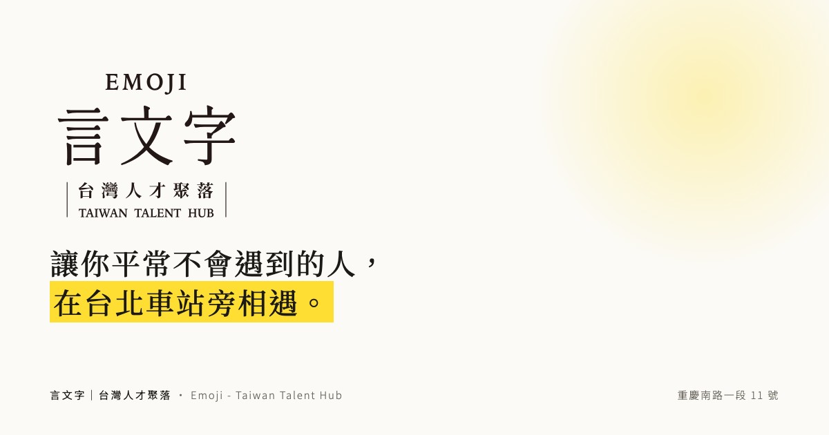
Use the fixed line as written in every public piece; do not rephrase it. The Chinese master line keeps 「你」, its clause order and its final full stop. Chinese: 讓你平常不會遇到的人,在台北車站旁相遇。 Japanese: 普段は出会えない人と、台北駅のそばで出会う。
3AM is a late-night diner or bistro, never a bar. Stay Square offers rest and seats; no lodging words. Name places by brand and function, not by level. The retired names Emoji Cafe & Bar, Member Plaza and Talent Lounge are no longer used.
Logo
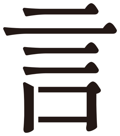
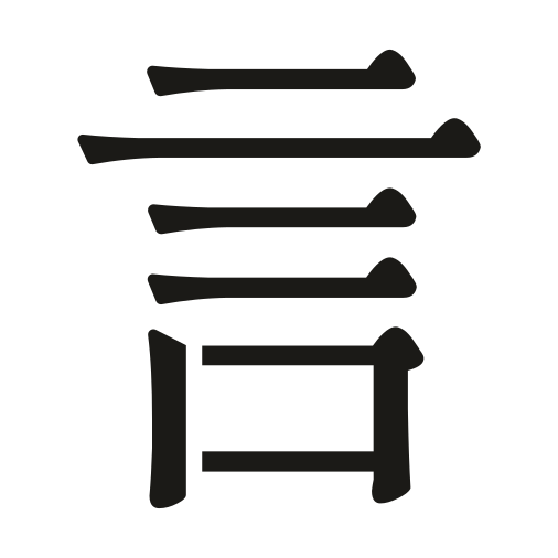
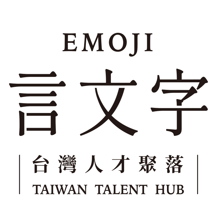
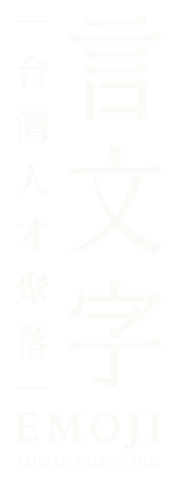
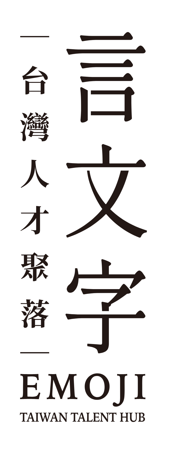
The mark is fixed. Never distort, recolor, decorate, rotate, crowd, or place it on a restless ground. Primary lockup: 言文字|台灣人才聚落. Favicon: the single character 言, transparent background, ink #1B1A17. On ink grounds use the reverse (paper) files. Vector ink fill: #231815.
Variants
Clear space
Keep at least about one-quarter of the character height as empty margin around the mark. White space is part of the identity: crowding the logo crowds the brand voice.
Do not
Color
Ink and paper form the neutral spine. Yellow is the only accent: at most one hit per view, always as a background, with ink on top.
One hit of yellow is enough
#FFDE34 is a highlight, never a wash: highlighter underline, badge, or text selection. Yellow is always the ground; ink always sits on top. One hit per view.
Typography
Ming-style serif display, classical Latin serif, sans for body. Each typeface has one role; never mix them. The logo itself is outlined vector art, not a font you can swap.
Checklist
Check before you publish. Compliance over flourish.
- Does yellow appear only once?
- Is yellow a background, with ink on top?
- Is the logo at original proportion and color? (reverse files on ink grounds)
- Is the primary lockup the Talent Hub (not the retired Cafe & Bar)?
- Does the mobile layout still keep yohaku?
- Are headlines in serif and body in sans?
- Is the tone short, plain, without exclamation marks?
- Is the name separator full-width 「|」?
- Does moji use only three elements and one yellow dot?
- Do the logo and moji stay off yellow grounds?
- Does each sub-brand use only its own color, not the yellow?
- Are places named by brand and function, not by level?
Assets
Logo and character assets are SVG / PNG. Download and use them as they are; never redraw or recombine them. Logos, brand colors, social avatars and source files for the three sub-brands — 在咖啡 (at cafe), 三點水 (3AM) and 等等空間 (Stay Square) — each have a page under Sub-brand identity. For a one-page overview of the parent brand see kit/; the version for design tools and AI agents is the Open Design package.
Press & partners: us@emoji.tw
Character · moji
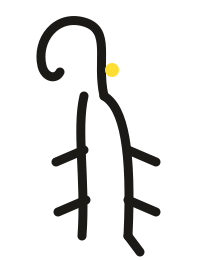
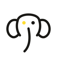
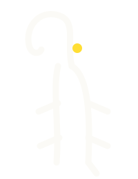
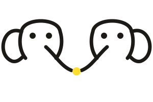
The elephant of emoji. The oracle-bone character for 象 (elephant) is simply a drawing of one. Pictographs are where Chinese writing began; emoji are the modern pictographs. This elephant hides inside the characters, and is the building’s earliest regular. Edition 01 · fixed 2026-08-26.
Name · only one: moji
Lowercase, set in the same type and case as emoji. In Chinese text it is still written moji; there is no separate Chinese name.
World · word, writing, character, then the elephant
The brand story had three parts; the elephant is the fourth. It is what grows once the characters are set side by side.
言
Words: what people say out loud.
文
Writing: words shaped into something that lasts.
字
Character: the smallest unit. Each person is one character.
象
Elephant: what grows once characters are set together. Pictograph, image, imagination, everything.
Speech becomes writing, writing sparks imagination, imagination becomes a world.言之有象 — words become worlds
Personality · an elephant in no hurry to speak
It has walked through many cities and understands many languages. It remembers the story of everyone who has come by. When someone needs to talk, it makes room. Not a mascot: the building’s earliest regular.
Symbols · three elephants, one line
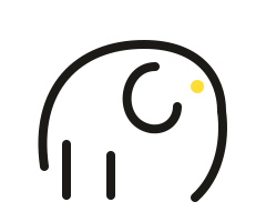
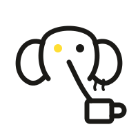
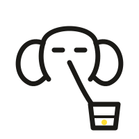
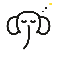
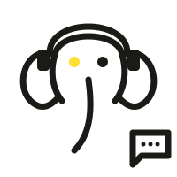
Never a realistic elephant. One stroke weight, one yellow dot. The front view is the main symbol, the oracle-bone glyph is the seal, and the profile guides people through the space.

Trunk · the trunk is punctuation
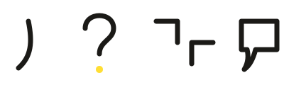
Take the trunk on its own and you get a set of punctuation. There is an elephant in the words, and words in the elephant.
States · one elephant, brands and services
Each state follows a business: at cafe, 3AM, Stay Square, plus the moment people meet.
Applications · where guests actually meet it
The elephant lives beyond the logo. From cup sleeves to the stairs, one set of lines ties the building together.
Someone is resting in this seat.
Language · the elephant’s event vocabulary
Long-lasting words built on 象, for event names, room names and content series. The Chinese names are the originals; English glosses follow.
Rules · do and don’t
Copy · things it would say
The yohaku voice. Short sentences, few adjectives, no exclamation marks.
The elephant was the first emoji.
The greatest form has no shape.
One person only touches part of the elephant.
The elephant remembers every word.
The herd meets at the water.
It can sleep standing up.
300,000 people pass by. There’s an elephant in the room.
This building is no ivory tower.
A place where stories take shape.
Words become worlds.言之有象
Character tagline: 言之有象, words become worlds. It does not replace the main slogan. moji is the building’s earliest regular, not a mascot.
Sub-brands
emoji is the parent brand. at cafe, 3AM and Stay Square are the sub-brands that run inside the hub. Each has its own logo and color, and shares the parent’s paper, ink and yohaku.
Japanese set meals and working coffee. Brand color #984C37 terracotta.
Late-night diner and bistro. Brand color #6B8FAB dusk blue.
The members’ space for rest and work; 24-hour access is conditional. Brand color #2B4064 navy.
Sub-brand identity: logos, social avatars and source files →
Specs
Sizes for common pieces and the contact facts. Check this table before you make anything.